
Beauty and the Beasts.
The brief for this exercise was to depict a still life arrangement using line, putting more emphasis on the reason of objects chosen, position and relation of textures to create a still life that has a bit of a story or meaning behind it.
Factors I considered were things like old and new, natural and man made, good and bad, or using similar shaped objects for the still life.
After a bit of brainstorming I decided on a relationship of opposites. I love a good juxtaposition so I narrowed it down to using objects that had something in common, but represented complete opposites. My common ground was ‘edibles’, and I coined my opposites ‘Beauty and the Beasts’.
This started to lead me to my composition as I wanted to add an emotional feel to the title as I think people can relate to things like ugly and beauty on a human level, even if it is inanimate objects relating the feelings!
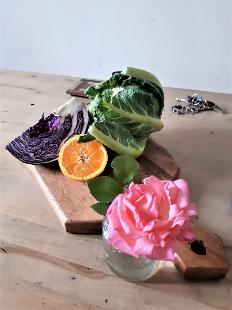
I decided on drawing ugly veg and set them against a freshly picked rose, hence the ‘Beauty and the Beasts’ theme. Playing around with the arrangement, I decided to clump the veg and fruit together on a chopping board and have the rose set aside in a jar of water, hence separating the ‘good, bad and ugly’! After a while of playing around with the arrangement I decided to include a red cabbage, cauliflower head, and sliced orange and the rose.
These all gave me a great variety of textures to work with, interesting lines to mark, with the intricate waves of sliced cabbage and the veined cauliflower leaves set against the shiny segments of the orange and the delicate folds of the rose.
I decided, as an exercise on line to draw it with a fineliner. I used a 0.3 Uni Pin for the whole of the drawing and I think, although starting out just using faint lines, I ended up working into it creating a bit more tone than I had to.

Looking back, it’s a shame it was drawn in monochome, as the photo shows the vibrant colours of the purples, pinks, orange and wood which would have made a great colour still life. Maybe something to keep in mind.
The most I learnt from this was the thought process into how you arrange the still life. What each object symbolises and if you can tell a story with it. I guess that way the viewer would be more engaged and be able to appreciate the piece more.
With regards to the actual drawing I felt the balance of dark and light tones were not laid out to give the best balance or contrast. The darker tones seemed to be concentrated in the top half and towards the right corner while the lighter shades such as the rose gets a bit lost in the bottom corner. Shading the table darker would have evened it up a bit and would have set the rose out from the background, so these are good points to keep in mind.
