
After choosing a selection of objects with very different and interesting textures I set about practising how I would actually make those objects ‘feel’ using varied marks with varied mediums.
Wool, wicker, sponge, tree bark and even different textured stones gave me scope to play around with the variety of surfaces and find out which medium suited each one.


I tried out coloured pencil for the stones as I could get a nice grain for the ruff stone and a more polished look by layering up the pencil for the smoother stones. The colour added to the solidness of the stones, but I found I must have built up the colour to fast and struggled to get a believable finish to them and they ended up looking like jelly beans with not as much definition as I’d liked.
Similar with the tree bark, I used coloured pencil again and managed to pull out the tones a little better, but it still looked a little faint and lacked definition. I think this just comes down to my technique and if I work on it a bit more I’ll be able to pull out more of a contrast of the tones and shade.
The wool hat lent perfect to graphite because I could both blend a fuzzy line and make sharp precise lines to create definition. I then lightly shaded over whole areas of shade and the graphite picked up the heavier lines and added to the depth of tone. I’ve found this technique in other mediums and am keen to explore it further as a way to describe depth in my drawings .
Using my own variables to render texture was an insight, but coming onto frottage changed my view of texture completely.
Frottage.
Originally used as a rudimentary ‘printing press’ for religious relics from the 1400’s, it was brought into a new light by the surrealist pioneer Max Ernst.

Adding to the spontaneous mark making of rubbing over textured surfaces he then let his imagination fill in the gaps to create dream like images of animals, forests, bizarre organic matter and pretty much anything that took his fancy.

Another more recent artist adopting this technique took my attention, Paolo-Medici, who specialises in frottage portraits, influencing me to go to Home Bargains and rip as many ‘sample sized’ textured wall paper samples as I could!
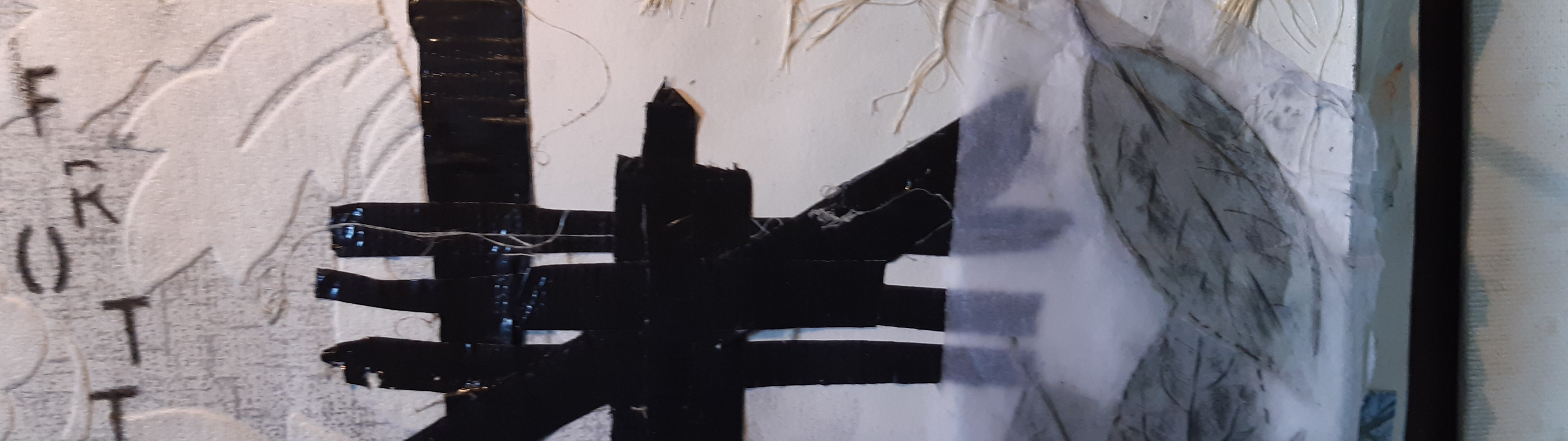
I found that frottage offered a unique way of layering where the surface being rubbed could be brought out with tone into another image, for example a tree, mountains or a face. The texture from one surface could be set in contrast to another and give striking effects, almost like drawing on tracing paper over an image underneath and seeing both as one. I’d like to explore this idea further and use it in future projects.

Using a 4b graphite stick I realised I could run the pencil over the outstanding contours of the surface underneath to get a defined line, then control the grade in between to get a nice definition to the frottage.
I could also get a two level effect by rubbing one image over the other as in the opposite image with the wallpaper and the sun dial. Taken further I think this technique could be repeated 3 or 4 times with good effect.


Using pennies, leaves, course cloth, wood and the plaster side of a bathroom tile I could get a lot of textures that I found created a dramatic contrast to the other. There is a lot of potential in this technique as I saw in Medici’s work and would like to take it further with collage as in Max Ernst’s work. Very satisfying.
References.
(1) ‘Wheel of Light’ Ernst M, 1925. Collotype after frottage. 10 1/4×1615/16″. https://scalar.usc.edu/works/the-space-between-literature-and-culture-1914-1945/media/fig-3-max-ernst-wheel-of-light-collotype-after-frottage-printed-in-black-10-1/2-x-17-in
(2) ‘Metamorphosi 20’, Medici P, 2019. Frottage on canvas. 100x100cm https://www.liquidartsystem.com/en/a/paolo-medici
