
Redon was a French artist 1840-1916, who painted in a variety of styles throughout his life, using symbolism as a reoccurring theme through his work. Although many of his paintings were in colour, he had a deep fascination with contrast, developing the relationship of black and white tones most notably in his charcoal sketches and lithographs.
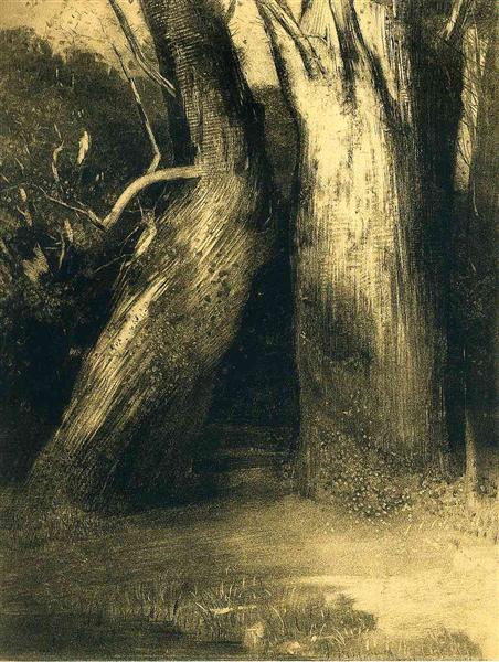
Drawings such as (1) ‘Two Trees’ done in charcoal, is a perfect example of how he used tone to accentuate the highlights using the dark tones to set a contrast. The lightest tones on the right hand tree are brought to life against the darker background and the lightness of the branch on the left hand tree is made to stand out almost three dimensional against the shadowed tones of the trunk behind it. The twisting grain of the bark not only define the movement of the trunk, but is also set in contrast with the flat darkness of the background creating more comparison between the trees and the dark forest behind.
The idea of contrast helped me understand the effectiveness of setting a light colour against a darker colour to pull the latter through more convincingly, creating a striking affect and adding greater depth and atmosphere to a drawing.
Redon worked a lot with lithographs and quoted (2) “One must admire black. Nothing can debauch it. It does not please the eye and awakens no sensuality. It is an agent of the spirit far more than the fine color of the palette or the prism. ” I find using black to darken areas not only emphasises the lighter areas, but keeps a drawing simple, explaining the essence of tone without complicating it with the distractions of colour. In this sense mono-chrome is much more powerful at portraying depth of tone, much cleaner and clearer than colour.
His work explains this technique well in such lithographs as:
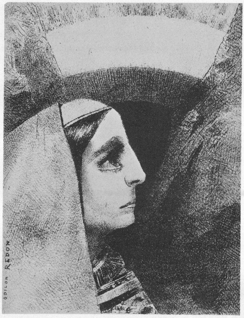
(3) ‘Before the Black Sun of Melancholy’ 
(4) ‘He Raises the Bronze Urn’ 
(5) ‘Water, Then a Prostitute’
All three lithograph’s use of extreme contrast helps to define the subjects and draw attention to the subject matter. The sharp lines in the face (3), the urn and its radiance illuminating the woman (4) and the prostitutes face (5) are all focal points of the pieces with the direction of the gaze controlled by the subtle use of contrast between the dark tones and highlights.
For me this is a very important technique to explore before using colour. By only concentration on the relationship of the contrast you can focus more clearly on how to emphasise and illuminate parts of a drawing by darkening the surroundings and adding to the depth of the composition.
References:
(1) ‘Two Trees’ Redon O. Charcoal on paper c. 1875. 63.5 x 49.5 cm. https://www.wikiart.org/en/odilon-redon/two-trees-1875.
(2)-(5) Taken from the book ‘The Graphic Works of Odilon Redon. Dover books on art and Art History’
(2) P22 “One must admire black…..fine colour of the palette or the prism”, quote.
(3) P65 ‘Before the Black sun of Melancholy’ (No 2 of A E Poe), 1882, lithograph
(4) P113 ‘He Raises the Bronze Urn’ (No 4 of Tentation de Saint-Antoine), 1888, lithograph
(5) P65 ‘First a Pool of Water, then a prostitute’ (No 1 of Tentation of Saint-Antoine), lithograph
