
Two large figure drawings complete with supporting material and a self portrait of any size was the final brief for the end of part 4.
The first was to be a seated figure drawn in line with particular emphasis on the 3d form represented on a 2d surface, expressing convincing depth and form.
Secondly was to express contrast of light and dark using tone to describe the form, intensifying the light to harden the edges of the shadows and highlights.
Working on a larger scale, I thought it best to go back to the basics and looked around for some tutorials on simplifying the figure into it’s most fundamental shapes. I came across a great youtube tutorial that explained how to break practically any form down into either a square or a circle: https://www.youtube.com/watch?v=6T_-DiAzYBc&t=80s.
It explains 6 principal ideas, 3 of with I’ll talk through as i found them a great help in understanding to visualize forms and simplify complex shapes.
- Structuralization
- Manipulation
- Observation
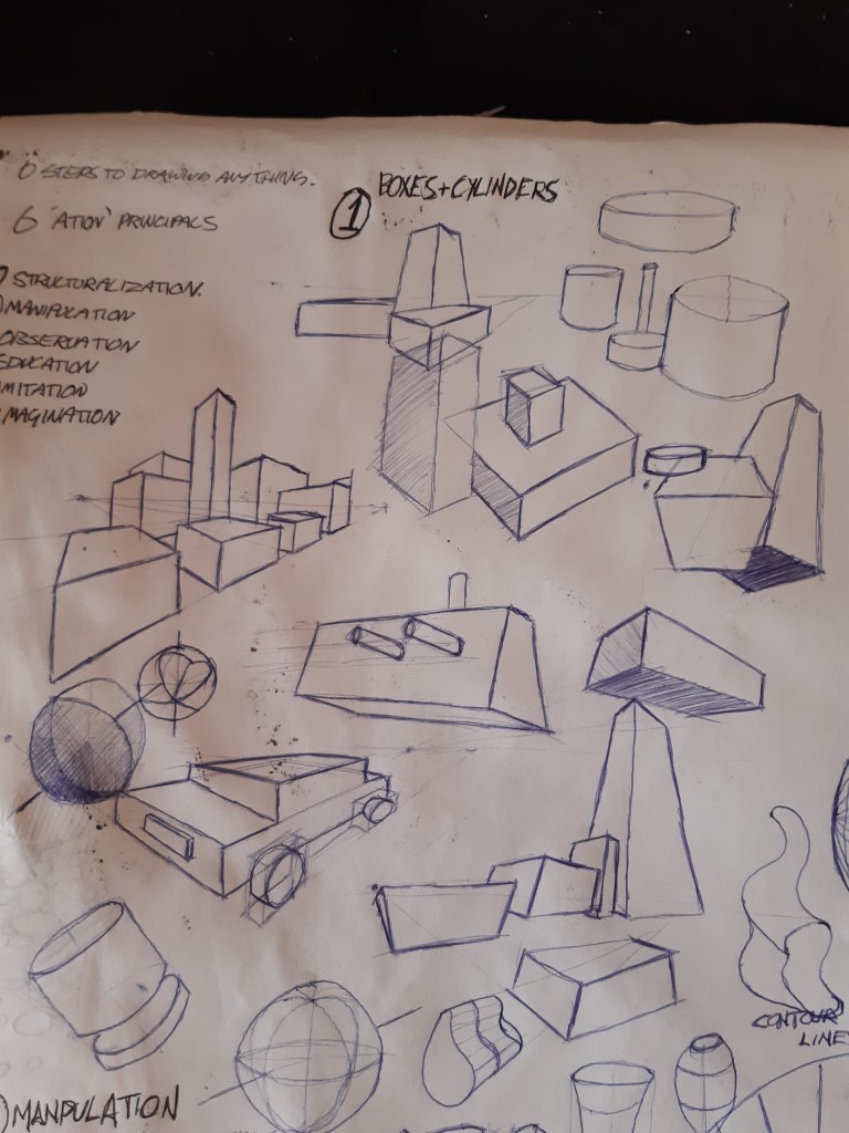
Structure. Firstly I got accustomed to drawing pages of boxes and cylinders, staring off simple, I gradually gained confidence by bunching them up, using different view points and perspectives etc. This was more a warm up exercise, but very under rated as it allows the creativity to start flowing as I asked my self the question, “how interesting can I make a circle and a square look?” This brought out more and more dynamic takes on the shapes which became more natural and fluid.
Manipulation. Next I looked at how I could manipulate the humble box and cylinder by squashing, bending, twisting, pulling, pushing, dilating, elongating, inflating, and anything else I could think of that ended in ‘ing’. This is where the fun started and the imagination took over, without worrying or getting frustrated by un important details. It also gave rise to the use of contour lines, and how effective they were at describing the volume of an object, giving it direction and depth in space. This was a very important discovery for later on when I started using it to describe more complex shapes such as the figure and the head. It allowed me to visualize where the forms were travelling in relation to each other, such as the movement of the legs while walking, (either moving towards or away), which really helped with creating depth to a form, also indicating where potential shadows and highlights would fall.

Manipulating simple forms 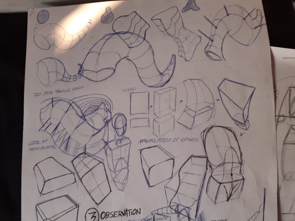
Adding contour lines
As you can see the development becoming more dynamic, adding the contour lines to a simple circle can create a sphere, and by angling two boxes on top of one another can create the start point of an upper and lower torso, which brought me onto the next stage of complexity.
Observation. From the simplified boxes and cylinders I was a much easier step to start to add in more rounded shapes to detail the basic curves of say the human figure. As long as the initial boxes were in the right place I could build up a more convincing overall form.

Using the contour lines to create depth and movement and taking note of reference points visible to the artist such as the angles of the collar bones, in relation to the hip bones, angles of the elbow and knee joints, the centre line of the spine, the sternum between the rib cage and the two protruding points at the base of either side of the rib cage I was able to put together a decent mapping of the pose in believable proportions to one another.

This especially helped with more dynamic poses where proportions were distorted somewhat and I had to rely on reference points in relation to one another to generate a convincing pose with foreshortening. The contour lines helped me to visualize the surface of the skin and the direction it was moving in, giving the images a more dynamic feel to them.
From here I used a guided tutorial on drawing a standing figure from imagination, using all I have mentioned above, plus the extra details of the way the skin, fat and muscle can be seen wrapped around the interior, and how it affects the exterior.

Pencil, showing reference points and contours, (front) 
Charcoal, (rear)
This gave me a very solid base of awareness of what to look out for on an individual model, especially for example, the contour lines of the leading and reclining legs, giving the pose more dynamics and movement. The basic skeletal structures in the abdomen, which reference points are visible and which lie under the surface, but influence the shape of the skin when stretched or contracted in different poses helped me to be able to imagine how they would behave in a different pose, and ultimately aid me to draw more realistically from imagination, which was one of the goals continuing from the previous exercise.
So going from squares and circles, to boxes and cylinders, and finally adding in the basic curves and angles in one drawing session, I pleasantly surprised myself as to how I was able to first break the form down into it’s simplest essence, and build it back up into more complex planes….now to put it into practice!
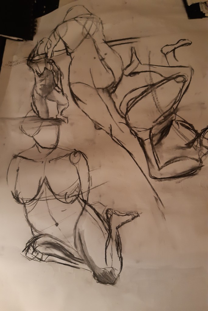
Figure Study using Line – seated.
For this exercise I did some preliminary sketches with charcoal and water to get a feel for the movement and models poses. using some drawings I took from my life drawing classes where I started to experiment with ink and stick, something I hadn’t used before, but worked well with the concept of line. I was surprised at the results and pleasantly drawn to the technique, giving a fresh, vigorous, almost animated character to the sketches.
With the ink and stick, I found it far more precise and demanding to be accurate to get the desired effect. However this actually flipped the style into a more rigorous, free and spontaneous technique, being faster and more precise actually opened up my creative instinct and allowed me to express a more fluid representation of the models poses. I could see more life and energy in the ink drawings that I could with the charcoal, so I guess personally I felt more at ease with the permanence of the ink, as opposed to the clumsiness of the charcoal. Maybe I just need to work on my charcoal techniques, but to me it felt more natural with the ink and stick technique.

So from there I decided to incorporate the two together and see what happened. Trying to create a contrast between the soft tones and shades of the charcoal, and the sporadic, permanent marks of the ink.

First I just used the ink and stick, adding a flash of depth with a water brush to give the pose a bit of depth and movement.
A nice progression with an interesting contrast between hard and soft lines/ planes I think it gave a good effect, I also experimented with concentrated coloured charcoal powder that could be flicked onto a wet surface, giving it a kaleidoscope effect where the paper was wet. Personally, if I was making ceramic bowls or tie-dye t-shirts in the 60’s I might have shown an interest, but I wasn’t truly feeling the technique as to anything I could spend time mastering.

Ink and charcoal powder concentrate. A1 
Ink and charcoal concentrate. A1
With regards to all the experimenting I decided for my final A1 figure drawing with line, the most striking and important technique that stood out for me was the use of contour lines. So I decided to draw a seated figure with one continuous line, without taking the pencil from the paper, concentrating on creating depth, form and movement in one fell swoop.

Looking back at the sketches I made I decided to take this image of the model, sitting on some cushions drawn with stick and ink, charcoal and water, attempting to render it into a more 3D image with the help of contour lines to express the directions of the limbs using only line.
I decided on a wooden, hard charcoal pencil so I could experiment with differing line widths and hardness to hint towards tone.
Starting out by mapping in the shapes of the torso, abdomen and centre line, I used a pencil and my out stretched arm to measure the height and width of the model and scaled it up x6 onto an A1 piece of cartridge paper so I could plot a grid to work with. This was probably the hardest part of the drawing, as, if this stage is miss represented it is difficult to retrace your steps when the drawing is half complete.
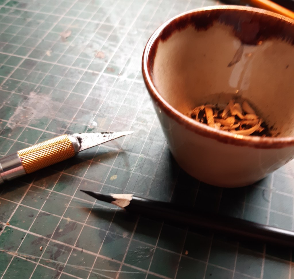
Charcoal pencil sharpened to a point 
basic framework over grid reference
I then just started to add in the out line and fill in the gaps with contour lines of different thicknesses to indicate tone.

Almost like a crude cross hatch I mapped the contours of the various planes, bumps, shadows and highlights to give a depth and volume to the drawing.

I added a contrast with charcoal powder for the background and some crude expression lines to describe the cushions the model was sitting on giving three varied approaches to line, giving the drawing a nice sharp characteristic. In hindsight, I should have stepped back from the drawing a bit more as I think the leg on the left is a little bit too elongated, but only slightly.
Put side by side you can see the difference between the stick and ink drawing on the left, being expressive, but fairly flat, and the contour drawing on the right that gives a more intimate and engaging appearance of depth and movement.

ink and stick 
charcoal pencil and contour lines
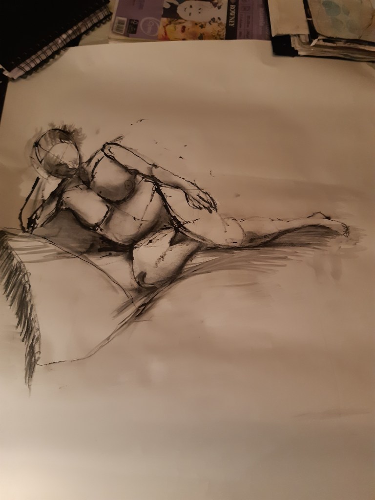
Next was to focus on a reclining figure, concentrating on tone as opposed to line to define the overall shape and depth of the model.
