
This is a theme that I’m revisiting for a couple of reasons, the themes I have picked up on, the themes I’ve developed from the previous exercises and the development of my mark making. I hoped to tick as many boxes as I could covering the concepts I’ve learned up until now. My still life way a couple of teddies, sunglasses, a deck of cards and a hip flask.
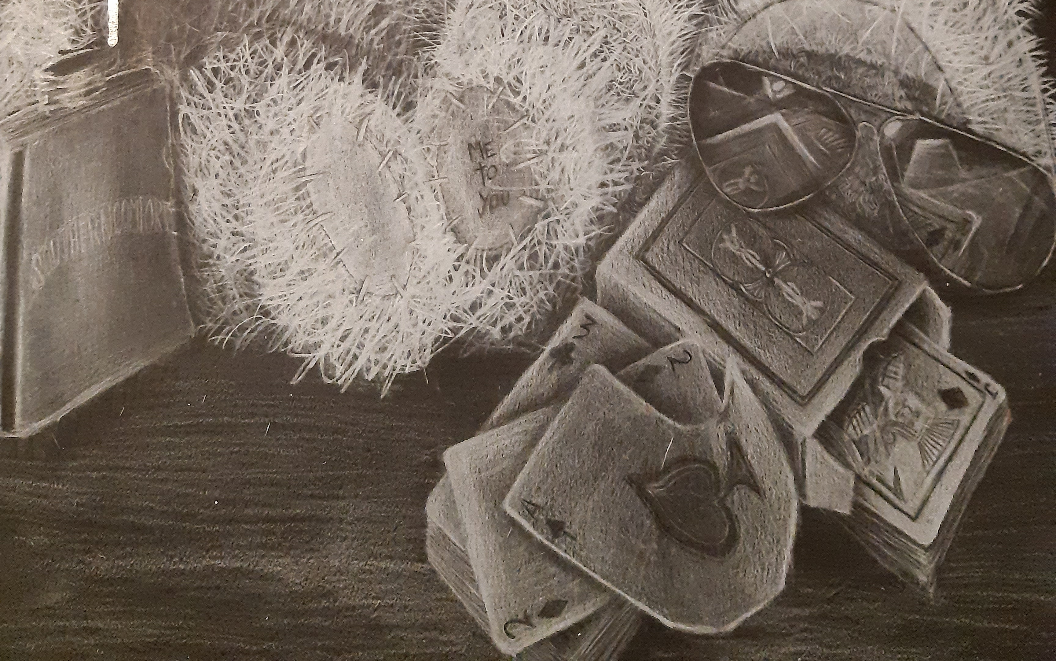
Texture – Using a variety of textures I chose two different types of fur, the reflection of a pair of sunglasses, deck of cards crumpled and stacked, the labels on the cards and a metallic hipflask.
Hoping to be able to convey the ‘feel’ of the objects through the mark making exercises I did with the awareness of the 3D shapes, deck of cards and the attention of detail with the individual cards. Making a convincing reflection in the glasses and shine in the hip flask, and attempting to create a convincing round form covered in fur.

Medium – Choosing to draw in mono chrome I mainly used white coloured pencil on black card. I knew I could get a variety of marks, smooth, grainy, blended and accurate on a relatively small scale and the coloured pencil also gave me a solid block of colour to work with.

After the outline I decided to try and build up a some subtle layers of different mediums to see if it gave more of a 3D effect without appearing to busy. Applying a thin wash of diluted white ink to the highlighted areas I overlapped it with white chalk pastel. This I was hoping to help create a sense of contour and direction by using the blending stick. I figured this would create a nice base of subtle tones to help mainly with the fur on the teddies. I knew I could draw over the chalk with the pencil without muddying the effect.
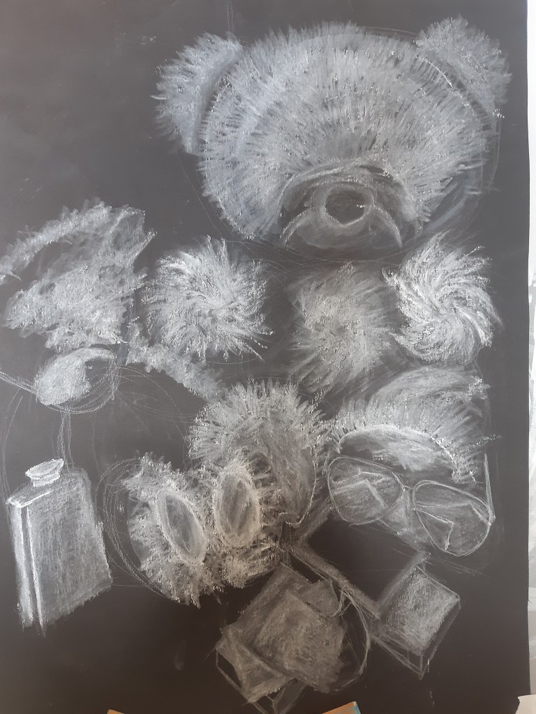
This actually worked well to give a nice direction of contour that I could then work the detail in with the coloured pencil.
Theme – The themes I wanted to convey in this piece were fundamentally the same as when I last drew this assignment. Mainly Irony and contrast. I wanted to draw a story as opposed to just a drawing of objects and add in the extra skills I feel I’ve developed from the previous exercises. The contrast lies in the black and white. Without the distraction of colour I felt it easier to concentrate on the impact of the drawing. A harsh light from underneath helped this I think. The irony is with the subject matter. On first viewing it looks like a cute scene with teddy bears, but looking closer I used the sunglasses, cards and hip flask to set a scene where the teddies are drinking and gambling. I find irony gives a powerful impact to connect and engage the viewer, to ask questions and become more involved with the drawing. This is what I was trying to portray with the use of the medium and subject matter.
Using what I had learned from the mood pictures I tried to take it a little further, going from the accurate drawing of the still life, to more of a mentality of the bear on the left, using lines to represent it. It’s hard to explain but I wanted to set the story of the bear crying over the hip flask as his mind has been destroyed by alcohol, hence the erratic lines and deterioration of detail.
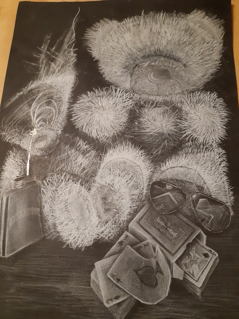
I’m not sure if I managed to portray it clearly, or if it just looks like I gave up drawing at that point, but I was trying to blend together emotion and mark making as learned in the mood board exercise.

One technique that I did use was that learned from the drawings with charcoal. I layered up the fur with coloured pencil over the chalk pastel to get an initial ‘grain’ then I found that i could use the eraser to ‘scrub’ out the fainter shading, leaving the more prominent marks visible. I could then lightly run the pencil back over the area which picked up the highlighted areas and made them stand out more. I found that I could keep doing this creating more and more contrast by lightly erasing then pencilling over to pick out the detail. I could also do this with a black coloured pencil to get the reverse effect, and working both of these techniques was able to get a satisfying detailed finish.

These are techniques I will definitely be developing as I’ve found I can use them an various other mediums to create a bold sense of depth. I’m not sure if the ‘mood’ part of the drawing fitted in quite as well as I wanted but I think it was an interesting concept.
