


Positive and negative space in art refers to the difference between the objects and the shadows that they cast by treating them as two separate entities. Positive being the actual objects themselves, and the negative referring to the space that is occupied or affected by the shadow.

Treating them as two separate spaces immediately opens an invitation to manipulate the two planes to merge, separate further or execute differently with different methods and media. Seen above, Hoong blends the shadow into the background in a stylised way, also manipulating the reflection to give a third angle to the image. However, most interestingly is to pull apart each space and either reconstruct it in a different way, swap the spaces around or cut them up, and it even gives the opening to introduce two or even more concepts to the picture, either complimenting, contrasting, or all together random. It gives you the ability to tell two or even three different stories in one image to the utmost effectiveness.

Many artists have been successful at manipulating negative space into fascinating and intriguing effect. Through my research I’ve picked out a few and looked closely at their individual styles as each interpenetrates the use of positive and negative space in their own particular way.(2) Debbie Smyth – Left Luggage
Debbie Smyth.
Debbie tends to work simplistically in black and white. However her handling of the positive and negative space have been stripped down and completely reversed, using the negative space to describe the outline and shape of the objects, leaving a little to the imagination in a sort of guess who style. An effective silhouette effect that boldly and cleverly describes her technique.
Her style seems to be influenced from the old technique of drawing with stitch and needle, often taught to school children, but not so much, (if at all) today. Depicting clear black and white tones, white wall, black thread, describing the familiar scenes we see everyday, children playing, people in the rain, trees, boats; yet the drastic perspective and sheer size of some of the pieces filling entire rooms, spilling out onto walls, ceilings and floors enhance a dramatic theatrical feel to the work.


Malcom Mcneill.
An incredibly talented illustrator who has the ability to merge and mingle multiple themes and ideas into one space with the manipulation of tessalating patterns, negative and positive space, as well as blank space.

Treating positive and negative space as two separate themes enables the artist to create two story lines, lending itself well to comic book style art, but can also be used well if the artist wants to portray a number of themes in one drawing or painting.
Patrick Caulfield.
A very stylised approach to painting and printmaking, Caulfield’s characteristic technique is one of bold, Pop art esque description. His use of simplified lines and bright, primary colours allows him to almost merge the positive and negative spaces, creating an almost disorienting blur between foreground and background, the near and far.


The sharp lines and reduced detail lends itself well to the mixing up of perspective and space that the artist has achieved through manipulating the view point, and the careful choice of colour, whether it be complimenting or contrasting seems to suit the style and theme of his paintings. I’m inspired by his use and harmony of colour. He seems to either blend similar colours together such as ‘bathroom mirror’ above, or completely contrast them as in ‘bananas and leaves’, also above. Either way the boldness of the lines and pure blocks of colour create a contrasting harmony that illustrates his style.
I especially liked the screen print ‘Bananas and Leaves’. The bold colours that clashed against each other helped to layer the picture into separate levels. Whether or not it was his intention, it seems to be split up into what appears to be the leaves on the surface of water, the surface of the water, the reflection of the leaves, then the bananas themselves. A very subtle way to create depth to the piece without the use of tone and shade.
Tang Yau Hoong.


Clever and quirky. Striking and to the point, a large percentage of Hoong’s work stand as a statement. A juxtaposition of ideas co existing in a single picture that can be instantly understood by anyone through the universal language of images. Stylised by bold contrasting colours and simple images, his use of negative space to meld together two ideas or themes are akin to an illustration or advertising background, however, straight forward, plain and to the point are definitely Hoong’s strong characteristics. As he quotes himself “The art of negative space”.
I admire his blending of ideas such as in the illustration below An Alcoholics Dilemma, where the viewer can almost read a story from the related images of the wine bottle/river/confused people looking for something.

Here are some more examples of some of Hoong’s work:


It was very interesting to compare such radically different artists take on negative and positive space. Taking the concept and utilising it in such unique ways was a great insight into the styles of each artist. I especially took note of McNeill’s handling of multiple layers, similar to M. C. Escher’s divided realities and tessellations; and Hoong’s imaginative and playful handling of themes and ideas, compiling simple visual cues to trigger off in depth ideas.
References.
1) ‘The Hermit’ – Caulfield. P. 1967. Screen print. 55.9×83.8cm. https://visualartsbritishcouncil.org/exhibitions/exhibition/patrick-caulfield- 2014/object/the-hermit-caulfield-1967-p885
2) ‘Left luggage’ – Smyth. D. 525×525, needle and black thread on white wall. mlung/workflow.arts.ac.uk/debbie-smyth.
3) ‘Abandoned and Malignant Heart’ Hoong. T. Y. Illustration for Cincinnati Magazine. http://www.tangyouhoong.com/portfolio/cincinnati/
4) ‘Exterminator’ – Limited edition. Mcneill. M. 1971. Graphite pencil, offset printing. P131 The Lost Art of Ah Pook Is Here.
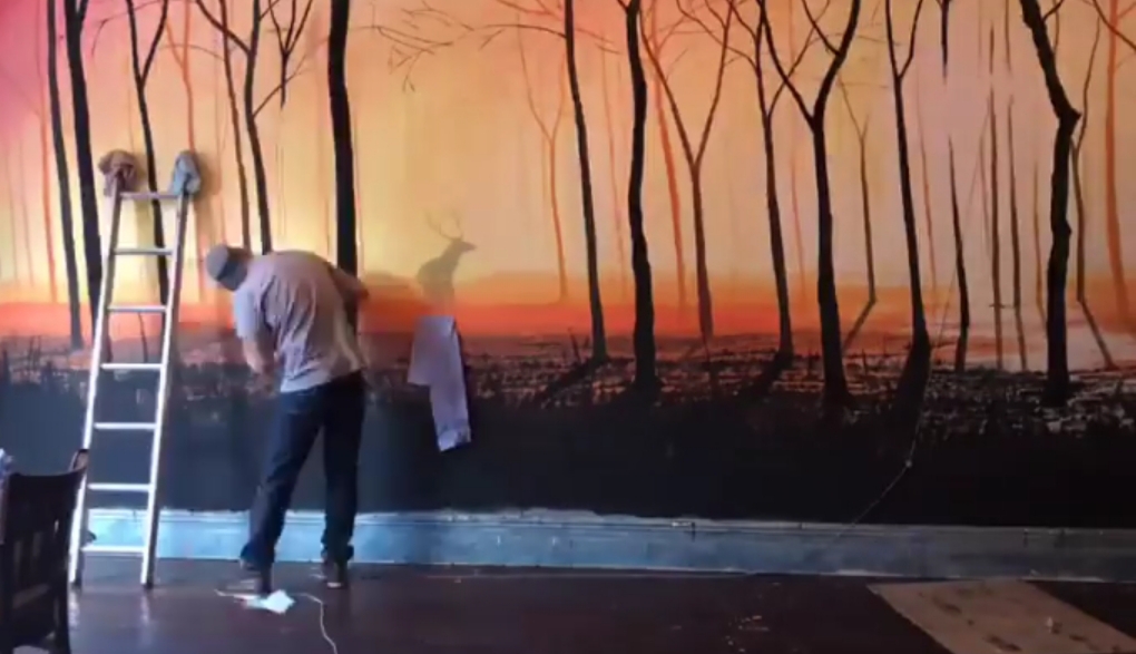
5) Smyth working on ‘The Jubilee Swing Bridge’ – Smyth. D. 19/02/2009. Photograph. Web: https://pictify-saatchigallery.com/342135/textile-artist-debbie-smyth.
6a), 6b) ‘In Full Swing’ – Smyth. D. 2013, 12x4m. Needle, thread, wall. Web: https://debbie- smyth.com/in-full-swing
7) ‘Untitled Sketch’ – Mcneill. M. 1971. Pencil, coloured marker. P75 The Lost Art of Ah Pook is Here.
(8) ‘Girl on Terrace’ – Caulfield. P. Acrylic on canvas. 84×60″ www.artnet.com/artist/patrick-caulfield/girl-on-terrace- x1sUtHykFLRZnABX8ytA2
09) ‘After Lunch’ – Caulfield. P. 1975. on canvas. 98×84″ Tate Gallery. www.tate.org.uk/artworks/caulfield-after-lunch-t02033
10) ‘Bananas and Leaves’ – Caulfield. P. 1977. Screen print. 73×79″ Web: http://www.artnet.com/artist/patrick-caulfield/banana-with- leaves/QGnTAiByDNKDdFqNqNqRA2
11) ‘Bathroom Mirror’ – Caulfield. P. 1968. Screen print on paper. 711x937mm. Tate Gallery. http://www.tategallery.org.uk/art/artworks/caulfield-bathroom-mirror-p04083
12) ‘Good Morning World’ – Hoong T.Y. https://mymindabout.wordpress.com/tag/tang-yau-hoong/
13) ‘Journey to The City of No Horizon’ Hoong T.Y. Cover art for book ‘The Upstream Doctors’ Rishi Manchanda. Web: http://www.tangyauhoong.com/portfolio/surrealism- and-illusion
14) ‘The Addiction Paradox’ – Hoong. T.Y. Feature in Science Magazine 2014. Web: http://www.tangyauhoong.com/portfolio/science-news.
15) ‘Pulling Out of Addiction’ – Hoong. T.Y. Front cover of Science Magazine 2014. Web: http://www.tangyauhoong.com/portfolio/science-news.
16) ‘Consumer Privacy’ – Hoong. T.Y. Illustration for the Financial Post. Web: https://www.behance.net/gallery/9265065/Editorial-Illustrations-Part111
17) ‘Erotic literature’ – Hoong. T.Y. Web: https://www.behance.net/gallery/1316541/the-Art-Of-Negative-Space
18) ‘Beware of Those Hands’ – Hoong T.Y. Web: https://www.behance.net/gallery/1316541/the-Art-Of-Negative-Space.
19) ‘Hour Glasses’ – Hoong T.Y. Web: https://www.behance.net/gallery/1316541/the- Art-Of-Negative-Space.
20) ‘Coexistence’ – Hoong T.Y. 500x500mm. Web: https://digitalsynopsis.com/design/negative-space-art-illustrations-tang-yau- hoong
