
This exercise was geared towards looking closely at expressing details of texture and tones. I took some fruit and veg and began to see how I could replicate the textures using a range of graphite pencils. Finding it more difficult than I anticipated I was getting a bit frustrated coming up with believable surfaces and textures so I decided to spend a bit of time practising my techniques until I was happy with producing a range of different textures.
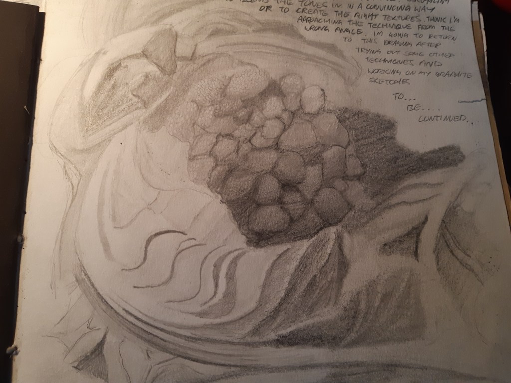
Starting with a cauliflower I was struggling to get a decent range of tones using a 2h, hb and 2b to give a believable depth so I started to experiment with how far I could layer the pencils.
Switching to a larger range of pencils, 2b, 5b and 7b I could get a much darker shade, but I found my technique a little rough, the cross hatching was too scratchy and I was aiming for something a little more refined. It was feeling awkward without the results I was after. Thinking back to my charcoal drawings I thought about incorporating the use of and eraser to bring the highlights out and blend in a base colour with a b pencil and a synthetic paintbrush.
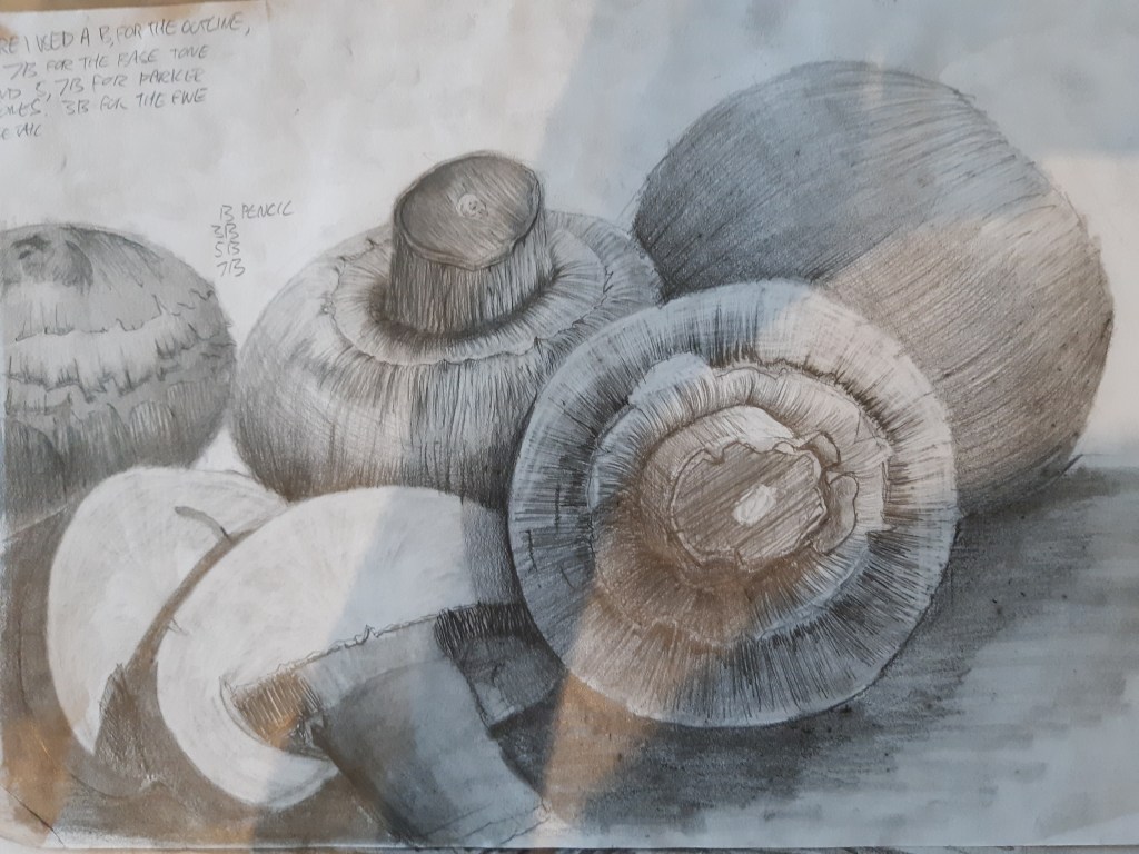
By blending in a base tone I was able to get darker shades with the softer pencils and I could bring out highlights with the eraser. I could then blend over the highlights with the base tone and keep erasing to get a more convincing contrast of tones. I also had a lot more control over the process and could keep re working the layers of shading to get the desired effect. Feeling like a more solid technique was emerging I carried on in this fashion but limited the pencils to 3. Base tone in a light b, hb or 2b. Then I could add mid tones with a 3, 5 or 7b and finally adding a deeper shadow and detail with a 8 or 9b. This way I had control of the detail and could lift out highlights and create a sharper contrast of tones.
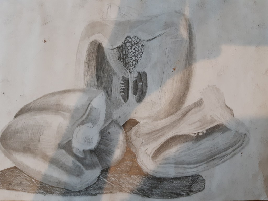
Peppers with h, 3b 5b graphite pencil 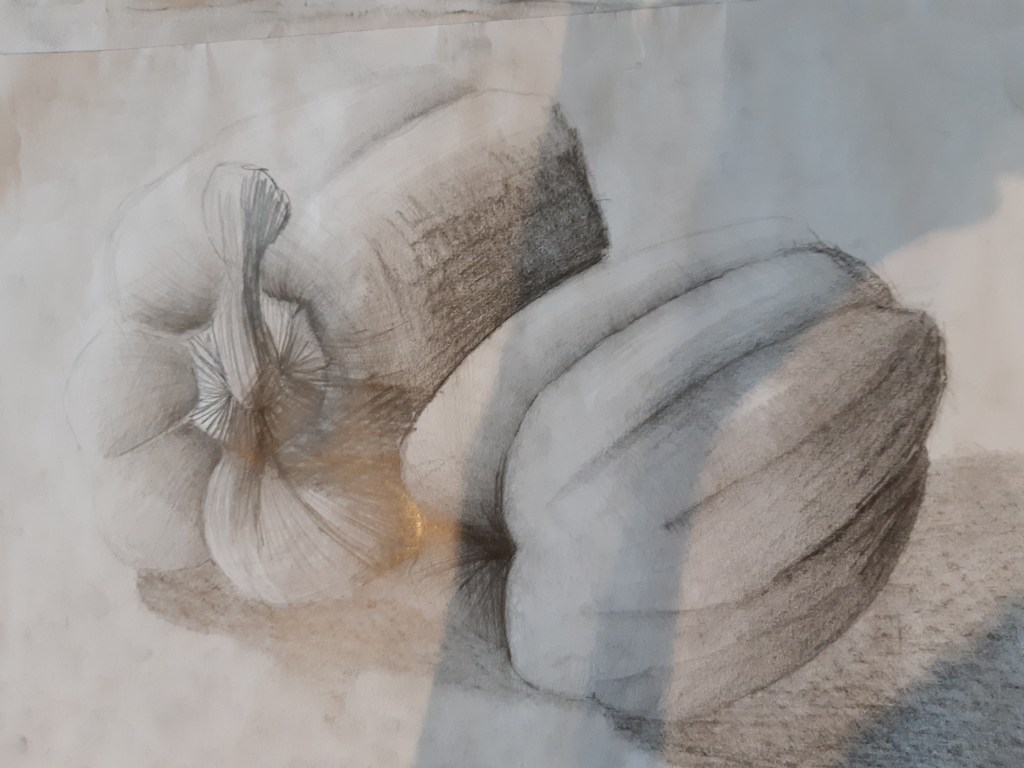
Peppers with h, 3b, 5b graphite pencils
This was starting to feel a bit more natural and I had a lot more control over the stages of the technique, making the process feel smoother, so I decided to carry on in this direction and see how far I could hone it.
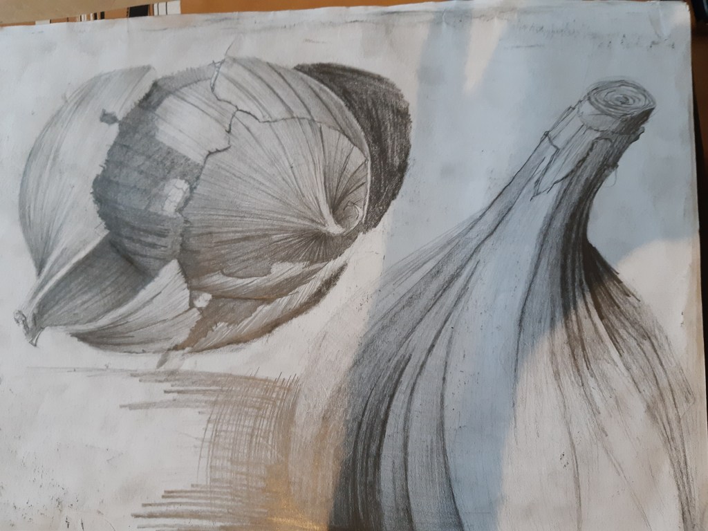
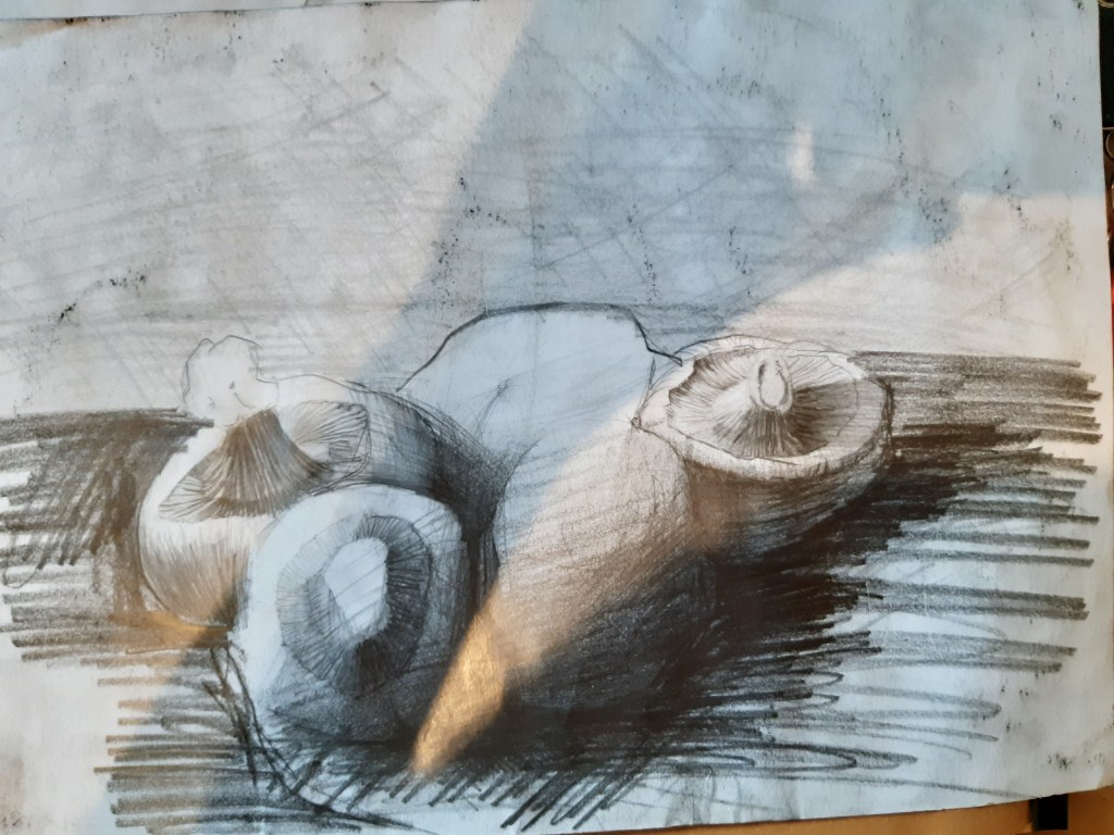
For the onions I used a darker 7b pencil for more contrast, but I felt like something was still missing. The drawings were still looking too flat against the paper and they were lacking a depth that I was trying to achieve. Looking for more control over the details of the texture, this is when I came across a Mono Zero fine tip eraser. It works like a propeller pencil with a 3mm ‘nib’ that is actually an eraser. With this I was able to pick out or lift very sharp and accurate highlights to give me the textures I was after. I could also layer the pencils on thicker and use the brush to blend them in. Bring out the highlights then go back over with the brush to give even the highlights a more 3d effect.
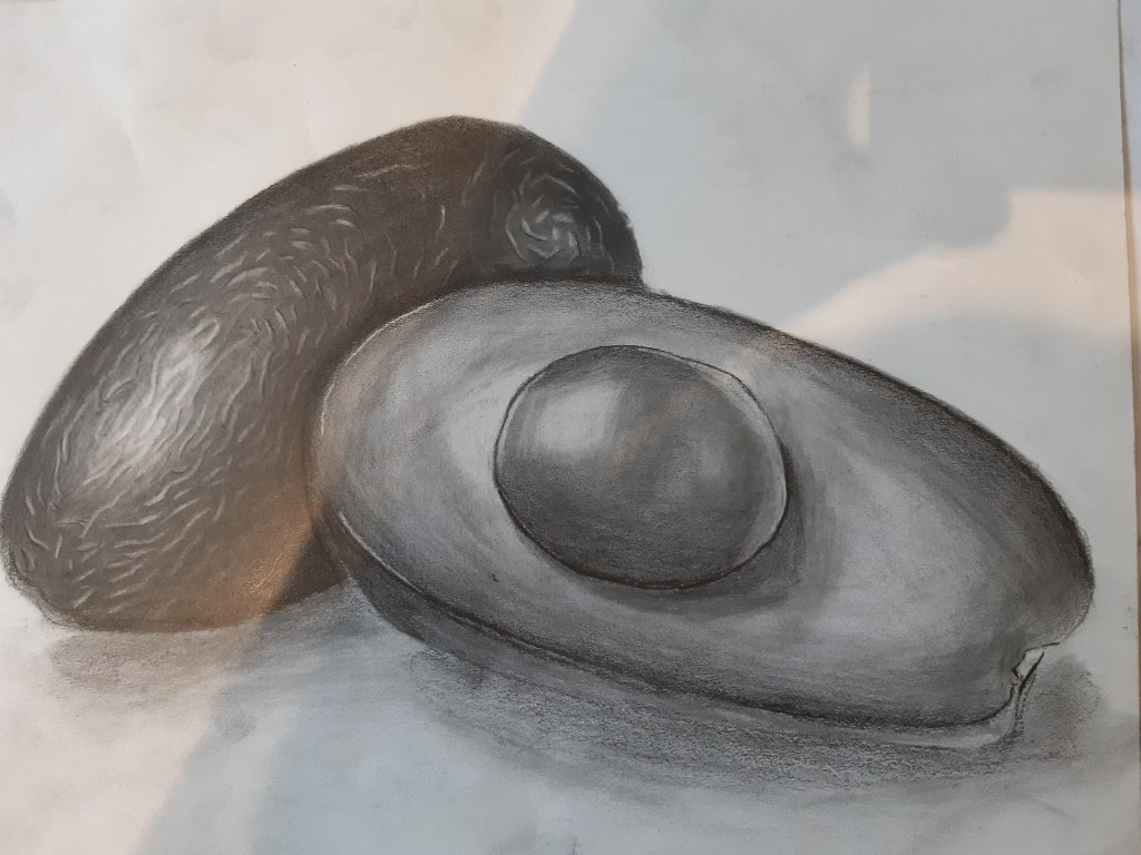
I felt this technique really lifter the drawings of the page and as I was using the pencil in heavier layers I was able to create a more defined surface texture. Then re working it by brushing over the highlights, adding more shade, highlights, the brush I found I could create a much more convincing 3D effect.

photo of pommegranite 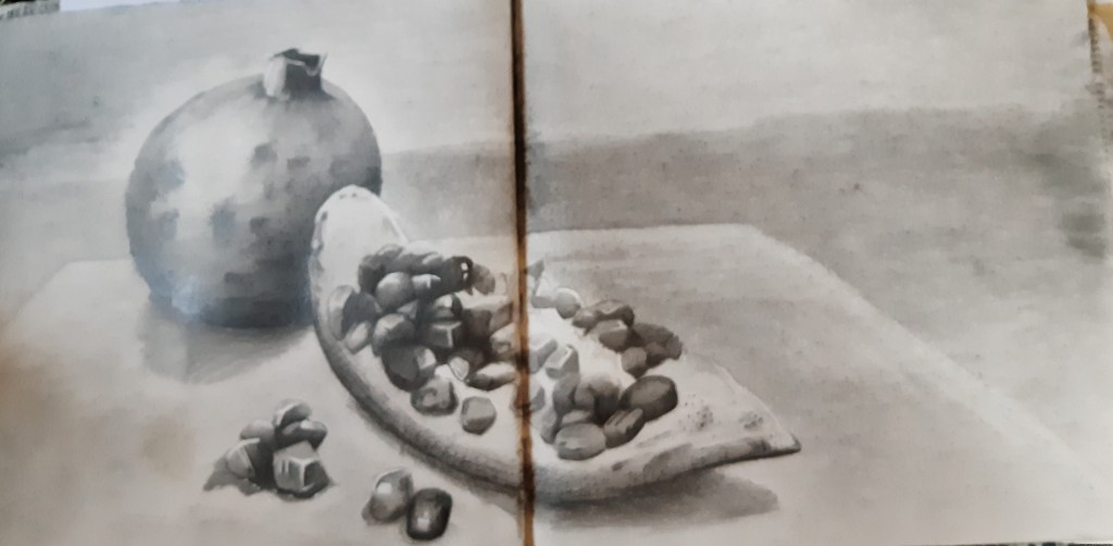
Pommegranite in h, 3b, 5b, 7b graphite 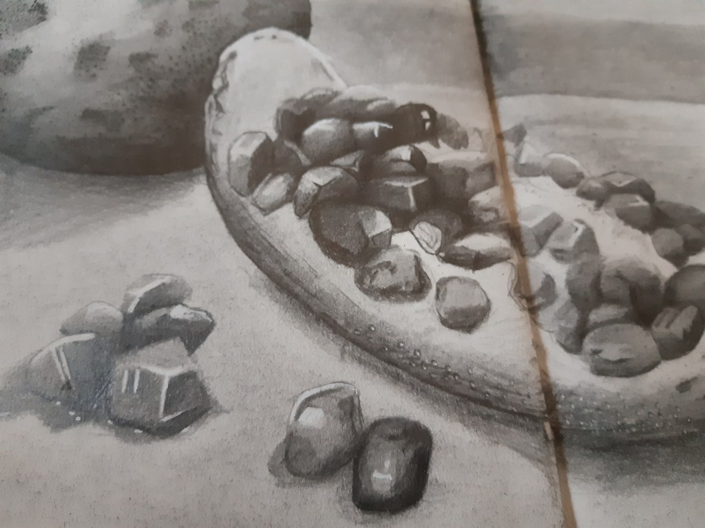
detail
I was much happier with this technique so I decided to include graphite powder as a background and give it a blurred out of focus look to it. With the pomegranates I also used a white fine line paint pen to bring out a sharper highlight and create a sharper contrast.
Now I had a simple but effective technique to work with I practised getting the fading more accurate and the contrast sharped with resulted in a texture that I was quite surprised with, but something I think I can use in other mediums such as charcoal, coloured pencil, and even marker pens. I plan the next stage to use it with colour.