
I was quite pleased with the outcome of this still life using coloured pencil and charcoal powder to create a nice contrast of the back and foregrounds. We were asked to consider a few points regarding composition, choice of objects, background, point of view and light which is a useful checkpoint considering all still life. Being in colour I wanted the objects to contrast each other , however I chose objects that had a theme running through them. I chose a green wine bottle, a wine glass, grapes and a tea towel.

The bottle had been crafted so it was twisted to give an interesting shine to the surface, and stood in the middle of the arrangement giving a rather abstract quality to it. In front was an old etched wine glass with some red grapes hanging over, creating a nice contrast in colour, and on the other side of the bottle I placed a glass of wine. These all gave me a good variety of surfaces to draw, and placing them on a red squared tea towel stood against the other objects as the lines on the towel curved and bent with the folds.
I was pleased with the arrangement as it had a nice diamond shape to it collectively and I lowered my viewpoint to almost the level of the table to make it look more striking. I let the light in through the window which made the background more dramatic and the arrangement was complete.
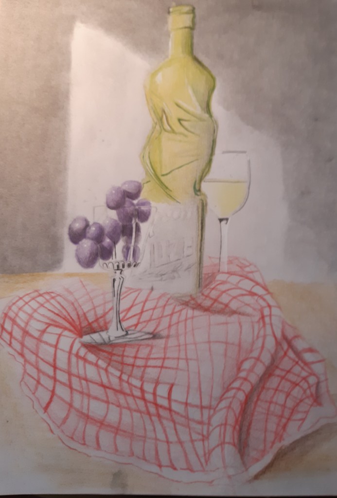
I think the only draw back was I should have payed more attention to the shading and darker areas of the drawing. It seemed to have depth with the bottle and the tea towel, but it seems to lack in contrast. I felt a bit hesitant with the coloured pencils and was worried about over working it. Something to keep in mind for the future. All in all I was happy with the outcome, and know where I could have improved it.
