
A still life drawing in monochrome was a great study for me. Trying to keep it simple I broke down the task into two main categories, colour and mood. Colour being the hue I chose and mood being the subject matter chosen.
Distilling it down like this I decided towards an intimate scene, close up, with maybe a studious desktop feel to it, influenced by (1) George De Tour’s ‘Mary Magdaline with a Night Light’. Both his extensive use of candle lighting, sharp contrast and intimacy aroused my interest in the artist. I love the idea of objects fading into view from dark to light, (maybe because I’m short sighted!), but it’s something about the concentration of a subject or object that is opened by the light directed on it. Controlling how soft or harsh, intense or mellow that light, can create a very sharp and intense feeling for the overall emotion of the drawing.

The use of mirrors also has taken my attention with reflections being an extended angle of views that can be manipulated to add extra depth and interest to a drawing.

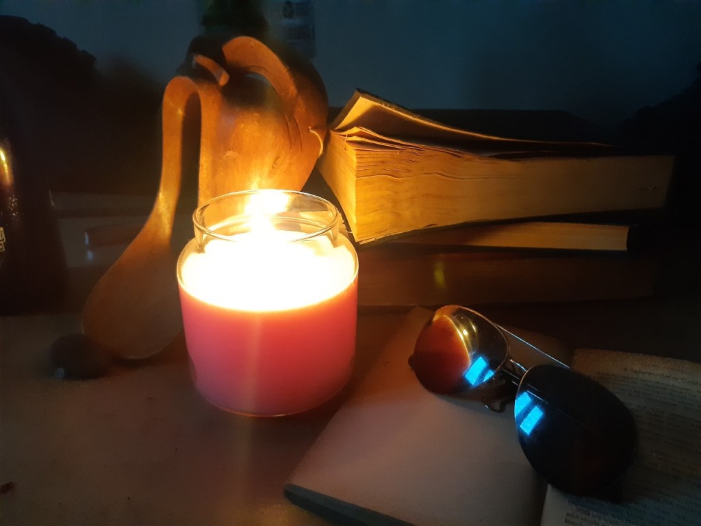
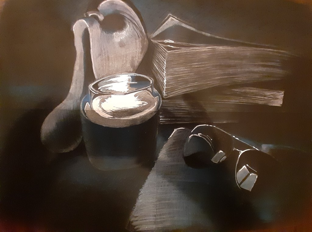
With these things in mind I decided on a still life in the dark, including the candle that is lighting the scene up, a close up of a stack of books (De Tour esq), an open book, originally an inkwell and feather that I decided to discard after putting the composition together because I thought it was getting cluttered, and a scary olive wooden mask I picked up in Greece years ago and a pair of glasses to create a reflection. I’m sure there is story behind this somewhere but I think it’s an aesthetically pleasing scene with the main theme being intimacy and darkness into light. Learning and the intimacy and concentration it deserves as a theme, and the contrast of hue that I decided to draw a candle lit scene in blue. I think it creates more of a mellow mood than if I were to do it in reds or yellows, and I think a more fitting mood to the themes of the drawing such as study and contemplation. I added the glasses to create a reflection of the candle and expand the interest of the picture.
Deciding what medium to use between chalk pastel and oil pastel was narrowed down to two things. Oil would have to be on a larger scale to get the desired detail for the book pages etc, but would give the perfect deep luminosity and solid vividness of I wanted for the drawing. Chalk would not give me that and in my mind it’s a messy medium and I struggle to get decent results from it. So I decided to go with chalk! I was determined to get a good finish with them when by a stroke of look I came across chalk pencils. I hadn’t thought about these, but they seemed to me like coloured conte sticks and maybe just the thing I was looking for.
After deciding on the mood/composition, I played around with the colours and technique, deciding on only two shades of blue, a white and a black on black card. I found that using too many shades just muddied the picture and I wanted a nice crisp, sharp finish to it, so keeping it simple I had to add the layers with quick hard hatches and was careful not to over work it in case the chalk blended to much and the picture got blurred and foggy. This kept a vibrant hue sharp intense feel which is what I was looking for to imitate the intensity of the candle light. I then added white paint marker highlights to bring the candle and the glasses to life in contrast to the darkness of the background.
Critique.
Starting out by brainstorming what I wanted out of this drawing before I decided what to use or how to construct it really helped with the creative process. It felt that I could hone in on what the drawing wants to portray and leave out the things that are not needed. Studious, concentration, candle light, intense, focused, sharp, defined were some of the trail of thought that seemed to just follow on from one another, so as these words flowed I just built up an idea of what best medium to use, how to arrange it and what technique to use.
Looking back at the final piece I would have to say I wouldn’t change the composition, colours or medium, but I think I could have worked a lot more detail into it, mainly adding to the highlights in subtler ways. I think I was a bit apprehensive not to over work it out of fear I might smudge the sharpness and ruin the effect. All in all, my greatest achievement was to manage chalk to a degree that I was happy with. The pencils saved me tearing my hair out!
References.
(1) ‘Mary Magdalene with a Night Light’ Georges De La Tour, 1630-1635. Oil on canvas. 94-128cm, location: louve, Paris, France – https://www.wikiart.org/en/georges-de-la-tour/mary-magdalene-with-a-night-light-1635
