For this exercise I decided to draw my studio with a few key points in mind that I have learned from the past exercises. The material differences I took to refer to choosing a medium that best described the subject/scene/size, and use it to bring the drawing to detail.
I also interpreted this title to mean to include different materials in the subject matter as I wanted a range of different textures to try and portray.
Choosing my studio as the subject matter I wanted to create a contrast on the objects I included from the angles of the walls, the light and dark of the corners, the materials of the chair with throw, leather backed seat, wooden table, easel, carpet and various pens and papers.
I went for graphite as I wanted to explore using it on a larger scale that I’m used to and see what effects I could get. This would give me a good range of tones and also control over the finer details.
Another idea I wanted to outline was depth. I tried out an arrangement which had both details and different materials in the foreground and the background, adding to the intimacy of the piece, and sitting on the floor looking up or on eye level with the main areas of detail gave it a novel look.
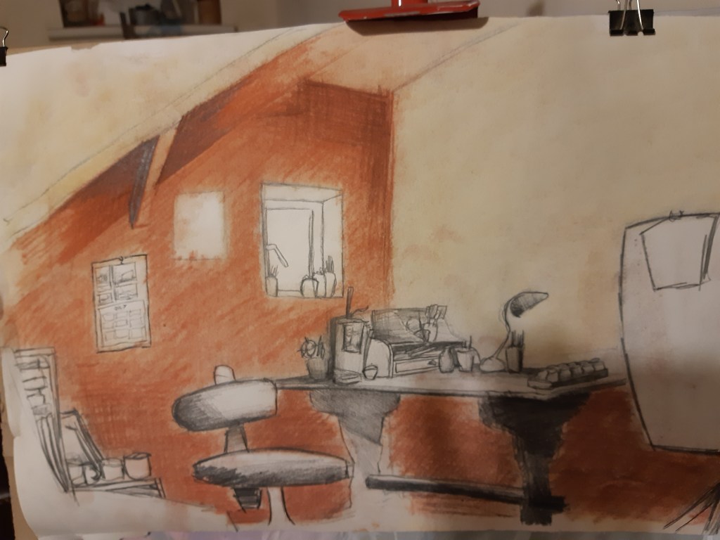
Starting out with a chalk pastel/pencil sketch, although on a smaller scale I could get a feel of suing larger, faster and more fluid strokes with the pastel, while I was able to sneak in some finer detail with the chalk pencils. This gave a nice contrast of the objects almost independently floating on the background which is the effect I was aiming for. It reminded me of the effect I was trying to achieve with the collage/frottage piece where I was trying to gain a sharp contrast with the fore/background of the table and the vase, almost like reversing the positive/negative space.
The final piece was on a larger scale of around A2, and what I wanted out of the graphite pencils was
– a high range of tonal value
– large areas of block tones
– control over detail
– a range of different textures
With this in mind I mapped out the scene, changed and added a few things from the original sketch and included the easel and chair more to add to the depth of the drawing.
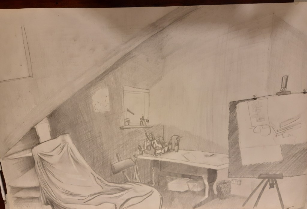
I was experimenting mainly with the long pencil strokes set in contrast with the details of the desk, chair and easel, trying to create a prominent cross-hatch grain to it, and although I think it was quite successful in doing this, I also think I would have got a better finish on it if I would have used the same technique as the graphite drawings of the fruit back in project 2.
Review and reflection.
The strongest points I felt I gained from this exercise was the differences of textures that I drew each object with. I managed to make them stand out individually, but were united by the use of the same graphite for each one. Graphite powder would have been preferred for the walls, but then I wouldn’t have been able to capture the perspective lines as well which I think gives it more of a dynamic feel. After the assignment I may try this again on the same scale but with the chalk pastel/pencils and see if I can keep up the range of tones whole adding a bit of colour to it.
I was also happy with the depth I managed to create and the angles helped with the perspective from the floor view point.
–
–
