
I took this exercise as a chance to group together everything I have learned about composition in landscape and try to come up with a view that ticks as many boxes as possiable.
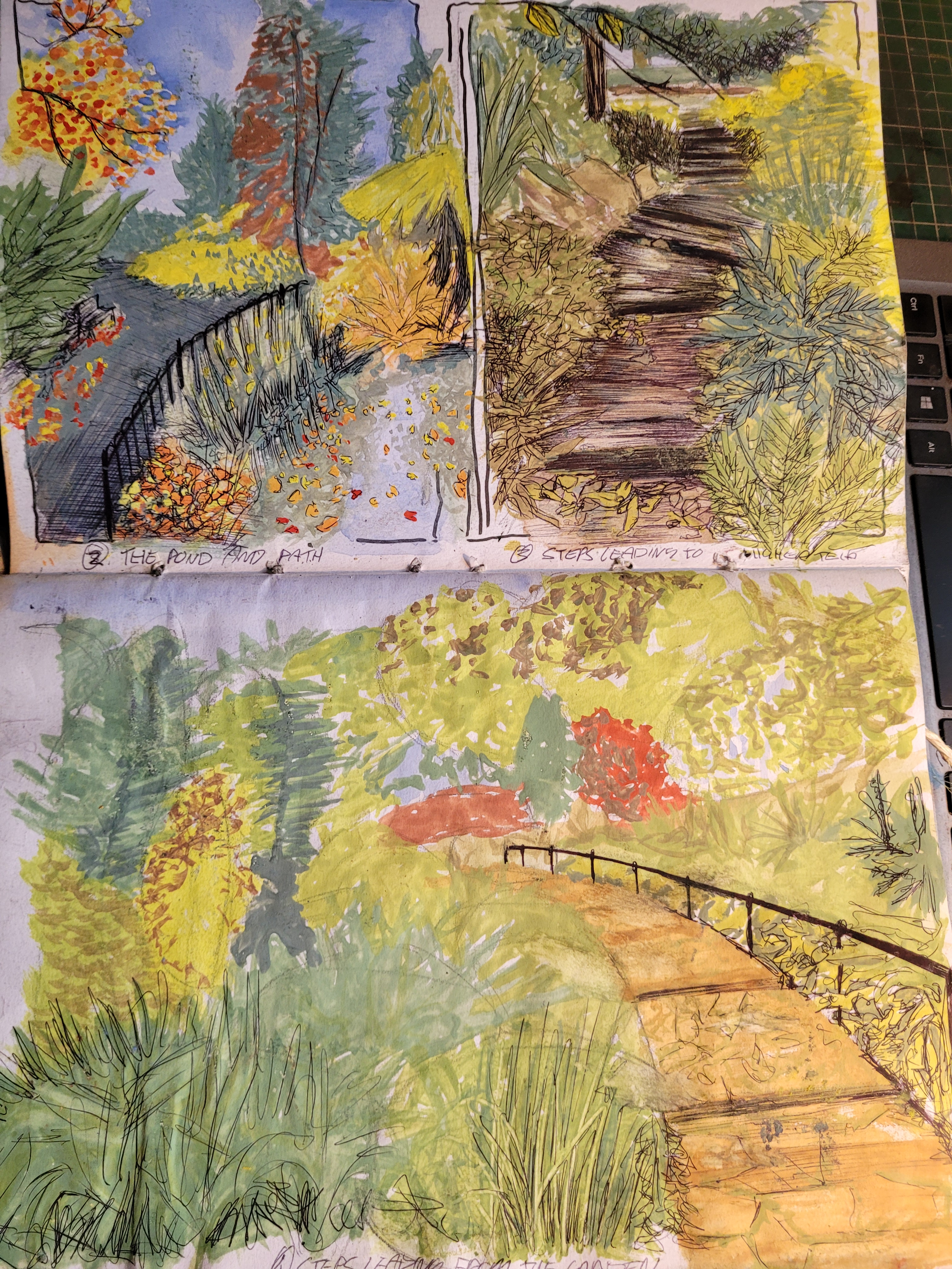
Starting off by looking back over the past two exercises, ‘sketchbook walk’ and ‘360 degree studies I looked close at the views I had chosen and scrutinized them for what and why I liked and picked them. Maybe on purpose, maybe subconsciously, it was interesting to ask myself why I had picked those specific views.

The elements I was drawn to on the sketch book walk through Fletcher Moss was:
- Colour: The gardens were a perfect intense representation of colour on a model Autumn afternoon.
- Atmosphere: Each scene I drew had it’s own diverse feeling and atmosphere, unique and personal onto it’s own.
- Intricate: The shear amount of textures and details of the foliage gave the gardens an intriguing, exciting and interesting quality to them.
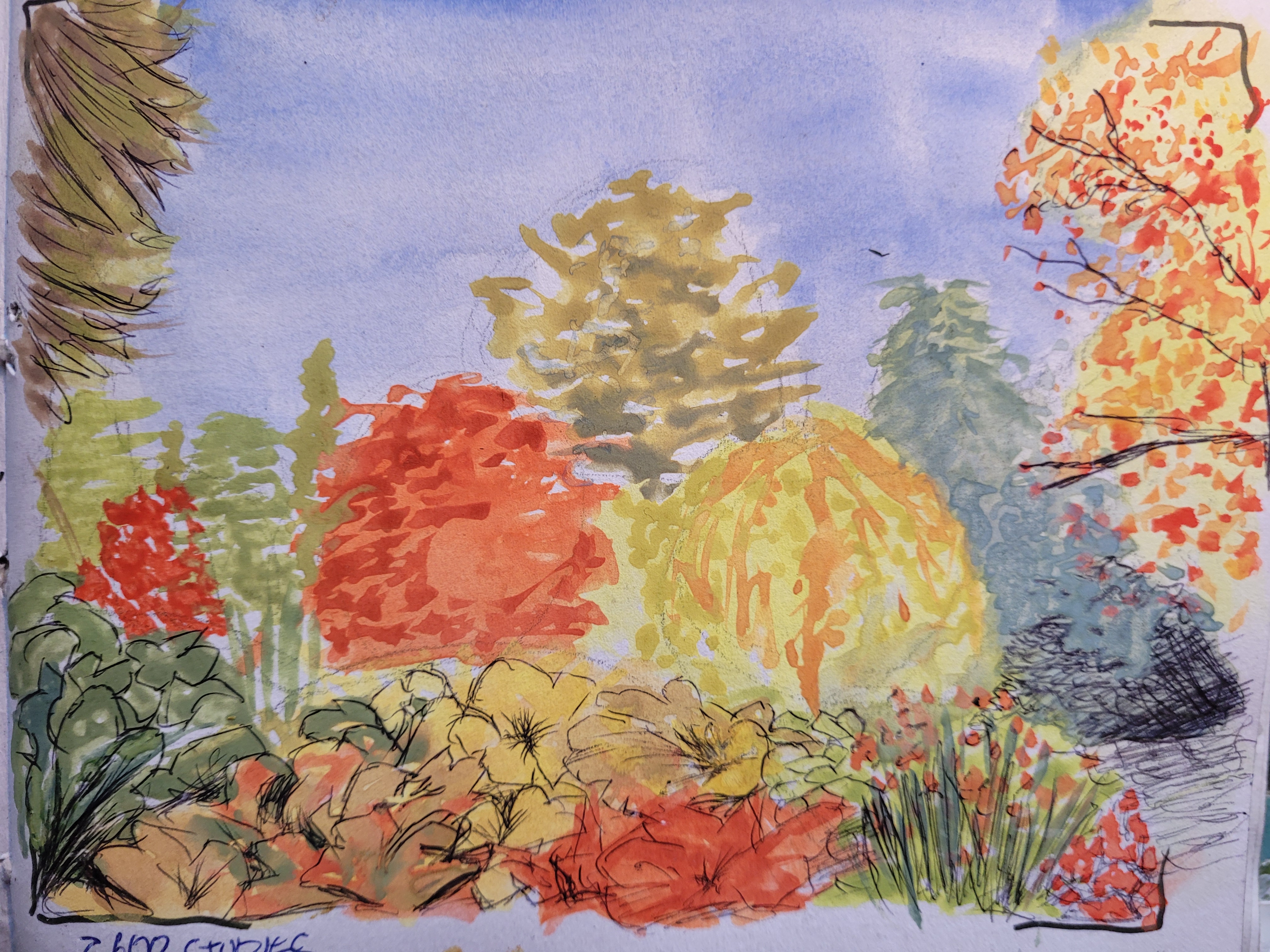
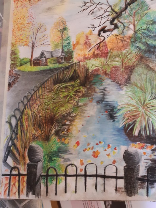
Making some quick sketches in my sketchbook in water colour and biro I managed to capture the essence of the bright autumn colours of the gardens.
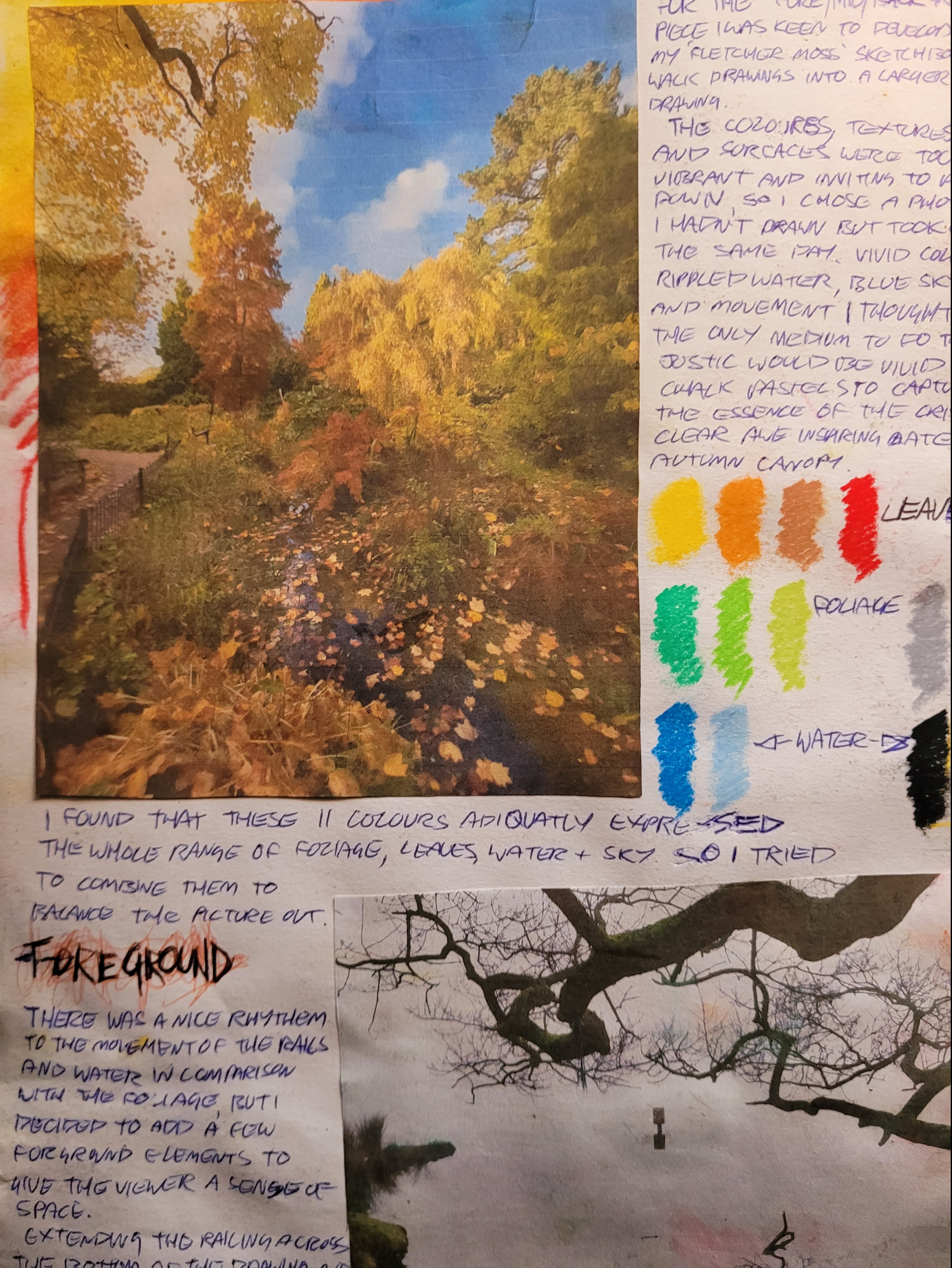
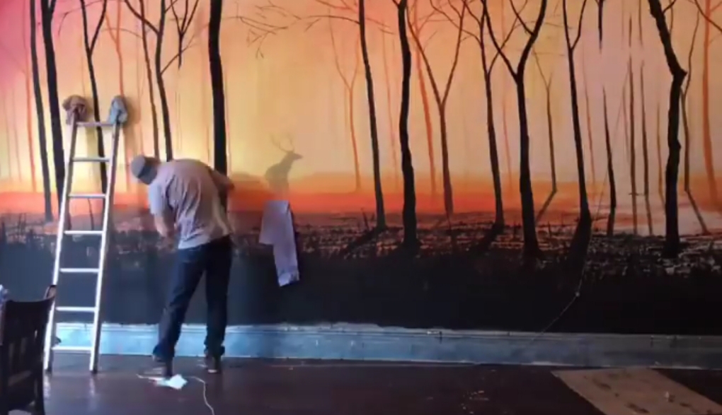
I then transferred this to a A3 coloured chalk drawing of the pond I had passed retaining the vibrancy of the walk.

The elements I took note of on the 360 degree studies were:
- Perspective: On all sides of me there was an intense depth of perspective, from the bridge to the buildings and the coast line that flanked me on both sides.
- Freedom: The feeling of space and freedom, looking out over the sea and feeling the air rushing in from further than I could see.
- Sounds: The jumble of sounds being carried by the wind, blending and clashing into an almost organic mass of sound ‘waves’.
From this point I started to look back over my photos to give me some inspiration after noting down all the words that I could relate to the question ‘What makes a good composition stand out?’.
Contrast/fore,mid,background/rhythem/focal point/perspective/patterns/harmony/proportion/unity, were a few of the concepts that came to me, so while I was looking through the photos I was a mentally ticking off the boxes to see which picture most fit the bill. This was a great exercise in itself as I found myself being evermore critical, looking closer at each one and asking questions, ‘if not, why?’, ‘what could have been better?’, ‘what is missing?’ etc…
This brought me to the conclusion that none of my previous photos lived up to the standard I was looking for so I decided to revisit Fletcher Moss with the list of ideas in mind and on a search for a scene that would fit the bill.
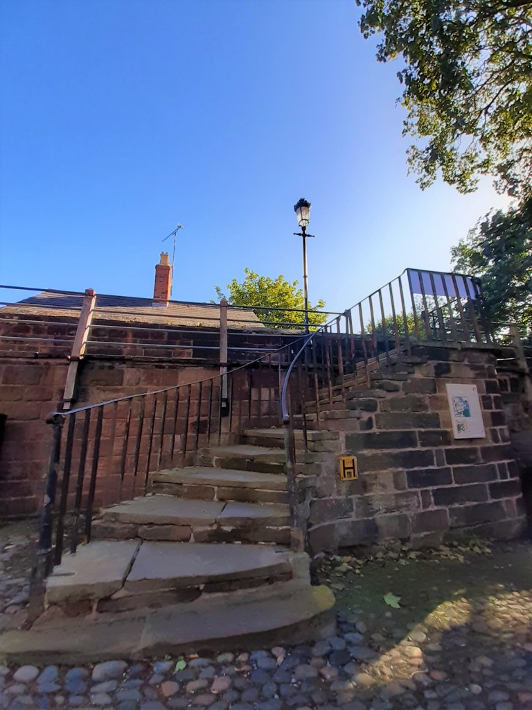
On the far side of the gardens leading up onto an adjacent meadow lane I came across a cobbled walkway leading off from the trees and foliage. Having not been this way on the previous visit I carried on down the path to be confronted by an old worn stone staircase directing towards a narrow back lane. ‘Confronted’ was the first instinct I felt which set the atmosphere for the following scene. Lowering my perspective line so that I was looking up towards the stairs I ran through my list of composition points as follows:
Perspective, check, focal point, old Victorian lamp, fore/mid/background, check, movement twists up the stairs, check, atmosphere, heavy stone, foliage, cottage, check…..etc, it had a lot of the points I was looking for so I decided to do a few quick sketches to see how I could render the scene.


I noted down on the photo all the points that I had picked up on and looking at my sketches noticed that I was mainly struggling with getting a convincing perspective on the curved staircase. In my sketches they were too flat, so I took a bit of time to practice getting the transition from the stairs above the perspective line, twisting down to below the perspective line and enlarging towards the viewer.

After managing this, I decided to render the final drawing in graphite pencil and chose a 3H to sketch the outline, 3B for the mid shading, 5B for the dark shading and a 2B mechanical pencil to sharpen up the edges. I was more interested in the composition and ‘weight’ of the drawing so graphite felt fitting for the job without the distraction of colour I could concentrate on the textures and detail of the stone, movement and atmosphere of the stairs and the overall composition of the scene.
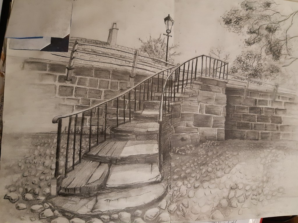
With accordance to the perspective I pencilled in the detail more so in the foreground and fading it out towards the sides of the drawing in an attempt to focus the attention on the staircase and lead the viewer up, onto the raised wall, hence the movement in the picture. The lack of colour I felt helped focus on the dramatic elements of the solid stone and cobbles, and the dominating perspective element to the drawing, the graphite monotone I felt worked well to relay the atmosphere.
